Sensory Diversity
  • Home
  • Blog
  • Neurodivergence
    • What is Autism?
    • What is ADHD?
    • What is Sensory Integration / Sensory Processing Disorder?
    • What is Misophonia?
    • What is Misokinesia?
  • Sensory Lifestyle
  • Sensory DIY
  • 0
577585
MisokinesiaUI Accessibility

Why Computers Are Not Sensory-Friendly: A Wake-Up Call for Inclusive Design

by Sensory Diversity January 17, 2025
written by Sensory Diversity

For many, computers are indispensable tools, seamlessly blending work, entertainment, and communication. But for individuals with sensory processing disorders, interacting with digital environments often feels like an assault on the senses. Poorly considered design choices, like moving objects, flashing elements, and intrusive sounds, can cause nausea, dizziness, and anxiety, making these tools more of a burden than a benefit.

Today, I experienced this firsthand when opening two popular gaming platforms: Steam and the EA app. Bright, high-contrast colors flashed across the screen, banners scrolled incessantly, and sudden animations popped into view. Within moments, I was overwhelmed, nauseated, and had to step away to avoid vomiting. Sadly, this isn’t an isolated incident—many aspects of modern digital design are inherently unfriendly to those with sensory sensitivities.

How Technology Triggers Sensory Overload

Common design features that are often praised for being dynamic and engaging can become major obstacles for people with sensory disorders. Here’s a closer look at the worst offenders:

  1. Loading Spinners and Unnecessary Motion
    Animated spinners, parallax scrolling, and bouncing buttons may look sleek, but they can cause dizziness and make focusing on the screen impossible. Excessive motion is particularly challenging for individuals with vestibular issues or sensory sensitivities.
  2. Auto-Playing Content
    Whether it’s GIFs, videos, or audio clips, auto-playing content can startle users and trigger sensory overload. The inability to control or stop these elements adds to the frustration.
  3. Cluttered Interfaces
    Overloaded layouts with too many visual elements competing for attention can overwhelm users, making navigation confusing and stressful.
  4. Ads with Disturbing Sounds or Visuals
    Sudden, loud noises or flashing visuals in advertisements can be jarring. These intrusions are particularly harmful to individuals who process sensory input differently.
  5. Screen Reader Incompatibility
    Poor integration with screen readers isn’t just an issue for visually impaired users—it also impacts those with cognitive or sensory challenges who rely on clear auditory instructions to navigate.
  6. Infinite Scrolling and Auto-Loading Pages
    While convenient for some, these features deny users the ability to pause and process content at their own pace, exacerbating feelings of sensory overload.

The Impact of Sensory-Unfriendly Design

The consequences of these design choices go beyond mere inconvenience. For individuals with sensory disorders, these features can lead to:

  • Physical Symptoms: Dizziness, nausea, headaches, and eye strain.
  • Emotional Distress: Anxiety, frustration, and the dread of encountering inaccessible platforms.
  • Digital Avoidance: Some may limit or completely avoid using digital tools, cutting themselves off from essential resources, work opportunities, and entertainment.

Steps Toward Sensory-Friendly Design

Creating a more inclusive digital world isn’t just about aesthetics—it’s about prioritizing the needs of all users. Here’s how developers can make their platforms sensory-friendly:

  1. Minimize Motion and Animation
    Provide options to reduce or eliminate unnecessary motion, including loading spinners, scrolling effects, and looping animations.
  2. Allow User Control
    Let users pause or disable auto-playing videos, GIFs, and sound effects.
  3. Simplify Layouts
    Clean, uncluttered interfaces reduce visual overload and make navigation easier for everyone.
  4. Improve Accessibility Features
    Ensure compatibility with screen readers and other assistive technologies, offering clear, structured content output.
  5. Regulate Ads
    Eliminate flashing visuals and disruptive sounds from advertisements to create a calmer browsing experience.
  6. Introduce Calming Modes
    Much like “dark mode,” a calming mode could reduce contrast, simplify layouts, and disable motion-heavy elements.
  7. Engage with the Sensory-Diverse Community
    Developers should seek feedback from individuals with sensory disorders to better understand their needs and test new designs.

A Call for Change

Today’s technology often prioritizes visual appeal and engagement metrics over accessibility, but that comes at a cost for many users. As someone with sensory sensitivities, the experience of opening Steam and the EA app wasn’t just uncomfortable—it was physically debilitating. If the tech industry continues to ignore these challenges, it will alienate countless users who rely on technology for work, communication, and leisure.

It’s time to demand more. Sensory-friendly design isn’t just a niche issue; it’s a vital step toward creating a digital world that works for everyone. If you’ve faced similar struggles, know that your discomfort is valid, and your voice matters. Let’s push for better, more inclusive technology that empowers, not overwhelms, its users.


January 17, 2025 0 comments
0 FacebookTwitterPinterestEmail
woman sitting in front of computer monitor explaining something two man and woman beside her
UI Accessibility

The Oversight of Accessibility in Technology: How Developers and Engineers Prioritize Their Own Needs Over the Greater Community

by Sensory Diversity January 16, 2025
written by Sensory Diversity

In the development of software, games, and devices, a significant concern arises: many creators design products primarily to meet their own needs, often overlooking the diverse requirements of the broader community.
This oversight can lead to accessibility barriers, user frustration, and missed opportunities for inclusivity.

Operating Systems and Accessibility

Operating systems (OS) serve as the foundation for all software applications, making their accessibility features crucial. Historically, as OS interfaces became more graphics-oriented, accessibility barriers increased for individuals who couldn’t see the graphics or use a mouse. For example, early text-based interfaces were generally easier to navigate for users with visual impairments, as screen readers could process text more effectively than complex graphics.

Despite advancements, many modern operating systems still lack comprehensive accessibility features. While some OSs offer built-in tools to assist users with disabilities, these features are often limited or not user-friendly. For instance, Apple’s macOS has introduced accessibility features over the years, but users report that certain functionalities are still lacking or difficult to use.

Software Development and Accessibility

In software development, accessibility is frequently treated as an afterthought. Many developers may not be familiar with the specific needs of individuals with disabilities or may not know how to implement accessibility features effectively. This lack of awareness can result in software that falls short in terms of accessibility.

Moreover, misconceptions about accessibility abound. Some developers believe that accessibility is only for people with disabilities, not realizing that it can enhance the user experience for everyone.

Gaming Industry and Accessibility

The gaming industry also faces challenges in this area. While some game developers have made strides in incorporating accessibility features, many games still lack options for players with disabilities. For example, certain games may not offer customizable controls, subtitles, or colorblind modes, limiting the gaming experience for a significant portion of the population.

Resistance to Adaptation

A notable issue is the resistance from some creators when asked to make their products more adaptive. Developers and engineers may view requests for accessibility improvements as additional burdens or may lack the knowledge to implement such changes. This resistance can stem from a lack of understanding of the importance of inclusivity or from the perception that accessibility features are secondary to core functionalities.

Conclusion

The tendency of developers and engineers to prioritize their own needs over those of the broader community has significant implications for accessibility in software, games, and devices. Addressing this issue requires a concerted effort to educate creators about the importance of inclusivity, integrate accessibility into the development process from the outset, and foster a culture that values the diverse needs of all users.


References:

  1. University of Washington. (n.d.). How does accessibility differ across operating systems? Retrieved from washington.edu
  2. Reddit. (2018, September 24). Tell me why you think macOS is more user-friendly than Windows? Retrieved from reddit.com
  3. Growth Acceleration Partners. (2021, July 6). The impact of accessibility in custom software development. Retrieved from growthaccelerationpartners.com
  4. Reddit. (2021, May 7). What are the biggest misconceptions about accessibility? Retrieved from reddit.com
  5. Wikipedia. (2024, January 13). Game accessibility. Retrieved from en.wikipedia.org
January 16, 2025 0 comments
0 FacebookTwitterPinterestEmail
UI Accessibility

Steam Should Consider Greater Accessibility and Use Reduce Motion!

by Sensory Diversity January 16, 2025
written by Sensory Diversity

Improving Accessibility on Steam: Addressing Sensory Sensitivities, Vestibular Issues, and User Experience for All

Steam is one of the largest digital distribution platforms for video games, offering users a vast library of titles, services, and social features. However, for many users, particularly those with sensory sensitivities or physical disabilities, the platform’s user interface (UI) and design elements present significant barriers to accessibility. These issues are not just minor inconveniences; for individuals with vestibular disorders, visual impairments, motor disabilities, or cognitive difficulties, the lack of accessible design can make the platform difficult or even impossible to use.

Among the many challenges Steam faces in terms of accessibility, the use of loading spinners is one of the most problematic. These rotating icons appear on nearly every page—whether logging in, accessing the library, viewing a profile, or navigating through Big Picture mode. For individuals with vestibular disorders, such as vertigo, dizziness, Ménière’s disease, vestibular migraines, or visual vertigo, the spinning animations can trigger intense sickness, disorientation, and nausea. The symptoms are often exacerbated by the rapid movement, as the brain struggles to process conflicting signals from visual and sensory stimuli. These visual cues, while functional for many users, are highly detrimental for individuals with vestibular issues.

The Impact of Vestibular Disorders and Motion Sensitivity

Vestibular disorders affect millions of people worldwide, and according to the Vestibular Disorders Association (VEDA), over 35% of adults in the U.S. will experience some form of vestibular dysfunction in their lifetime. For these individuals, even mild movement or flashing visuals can trigger debilitating symptoms, such as dizziness, vertigo, difficulty concentrating, and severe motion sickness. The presence of spinning icons on Steam’s platform only serves to exacerbate these issues. For example, individuals with vestibular migraines—who experience increased sensitivity to light and visual motion—are particularly susceptible to discomfort caused by such animations. Visual vertigo, another condition in which movement or visual stimuli can cause balance disturbances and nausea, is also aggravated by these dynamic elements.

When users encounter these visual cues, the motion can overwhelm their sensory systems, leading to a range of symptoms that significantly impact their ability to use the platform. Many users with vestibular disorders report feeling sick or disoriented when navigating the Steam interface, making it difficult for them to enjoy the games and content they wish to explore.

The Case for Reducing Visual Motion

To address these challenges, Steam should implement system-wide accessibility settings that would allow users to opt-out of motion-heavy elements. For instance, honoring the “Reduce Motion” preferences found on most operating systems (such as Windows, macOS, and iOS) could be a simple but effective solution. This feature, which is already available on several platforms, allows users to reduce or eliminate unnecessary motion in user interface elements, such as animations and transitions. By integrating this setting into Steam, users could automatically replace the spinning icons with a more static, neutral visual cue, such as a simple hourglass symbol. This adjustment would make the platform far more accessible for individuals with vestibular disorders, sensory sensitivities, or motion-related discomfort.

By making this change, Steam would demonstrate its commitment to creating a more inclusive platform for all users. Not only would it improve the experience for people with vestibular issues, but it would also align with best practices in digital accessibility.

Broader Accessibility Concerns in Steam’s UI

While addressing visual motion is an important step, Steam’s UI contains several other accessibility gaps that hinder users with various disabilities from fully engaging with the platform. These issues span a wide range of impairments, including motor disabilities, visual impairments, and cognitive difficulties. Below are some of the most significant accessibility challenges that Steam currently faces.

1. Lack of Keyboard Navigation and Focus Indicators

For users with motor disabilities or those who cannot use a mouse, Steam’s interface can be difficult to navigate using only a keyboard. While some keyboard shortcuts are available, the lack of a consistent and easily navigable system for moving between elements can make the platform frustrating to use. In addition, the visual focus indicators, which highlight the current element being interacted with, are often insufficient or unclear. This lack of clear focus management is a significant issue, particularly for users who rely on keyboards for navigation, as it becomes difficult to discern where the focus is on the screen. This issue also extends to screen reader users, making it difficult for them to interact with the platform.

To improve accessibility, Steam should enhance keyboard navigation and introduce clearer focus indicators, ensuring that users can more easily and accurately navigate through the UI using only their keyboard. This could include larger, more visible focus highlights or customizable focus styles to meet the needs of different users.

2. Limited Screen Reader Compatibility

For individuals with visual impairments, particularly those who are blind or have low vision, Steam’s UI is challenging to navigate. While there is some support for screen readers, the platform does not provide consistent or reliable functionality for users who rely on assistive technologies. Many images, buttons, and UI elements lack proper alternative text (alt text), and the overall structure of the interface is often not optimized for screen reader software. This can result in a fragmented or confusing experience for users who need screen readers to navigate.

To address these issues, Steam could improve the structure and labeling of elements to ensure better compatibility with screen readers. For example, providing alt text for all images and ensuring that headings and landmarks are used properly would make it easier for screen reader users to navigate and understand the content.

3. Inconsistent Color Schemes and Poor Contrast

For users with color blindness or low vision, the colors used in Steam’s UI can present a significant barrier. Many text and background combinations do not have sufficient contrast, making it difficult for users to read or understand the content. This is especially problematic for individuals with conditions like dyslexia or age-related vision impairments, who may already face challenges with legibility.

Steam could address this by offering more customizable themes with options for adjusting color contrast and modifying the color scheme to better suit users’ needs. Implementing a “high contrast” mode would help users with color vision deficiencies or low vision access the platform more comfortably.

4. Lack of Customization for Cognitive Disabilities

For users with cognitive disabilities, such as ADHD or learning disabilities, Steam’s dense and information-heavy interface can be overwhelming. The sheer amount of text, buttons, and interactive elements can cause confusion, making it difficult for users to focus on key content. Additionally, important notifications and updates can get lost in the clutter of the interface, further hindering the user experience.

To improve accessibility for individuals with cognitive impairments, Steam could offer a more customizable UI that allows users to simplify the layout, reduce visual clutter, and modify the amount of text or information displayed. By giving users the ability to organize the interface in a way that suits their cognitive needs, Steam could enhance usability for a wider range of individuals.

5. Lack of Support for Alternate Input Devices

For individuals with motor impairments, Steam does not currently offer sufficient support for alternate input devices, such as adaptive controllers, eye-tracking technology, or switches. Many users with physical disabilities rely on these devices to interact with their computers, but Steam does not fully integrate or support them. This lack of compatibility prevents users with motor impairments from engaging with the platform in a way that accommodates their needs.

By adding compatibility with a broader range of assistive input devices, such as adaptive controllers and head trackers, Steam could make the platform more accessible for users with motor disabilities. This could include customizable control mapping options, allowing users to tailor the platform’s interface to their specific needs.

6. Absence of Subtitles or Closed Captions for Videos

Another area where Steam falls short in accessibility is in its handling of video content. Many of the videos available on Steam, such as trailers, news updates, and promotional content, do not include subtitles or closed captions. This lack of support is a major barrier for users who are deaf or hard of hearing, as they cannot fully access or understand the content being presented.

Steam could significantly improve accessibility for users with hearing impairments by consistently providing subtitles or closed captions for all videos on the platform. This would ensure that users who are deaf or hard of hearing are not excluded from important content, including promotional materials and game trailers.

Conclusion: Creating a More Inclusive Steam

Steam is a beloved platform for gamers worldwide, but its current UI and design features leave much to be desired in terms of accessibility. From the use of spinning loading icons that exacerbate vestibular disorders to the lack of support for alternate input devices and cognitive disabilities, there are many areas where Steam can improve to create a more inclusive experience for all users. By implementing changes such as honoring system-wide “Reduce Motion” preferences, enhancing keyboard navigation, improving screen reader compatibility, and providing better contrast and color schemes, Steam can become a truly accessible platform that accommodates the needs of all its users.

Accessibility is not just about convenience—it’s about ensuring that everyone, regardless of their physical or sensory abilities, can enjoy the platform. By taking these steps, Steam would not only improve the experience for users with disabilities but also align with best practices in digital accessibility, creating a platform that is welcoming and usable for all gamers.

References:

  • Vestibular Disorders Association (VEDA). (2020). What is a vestibular disorder? Retrieved from https://vestibular.org
  • American Migraine Foundation. (2021). Migraine and Vestibular Disorders. Retrieved from https://americanmigrainefoundation.org
  • Web Content Accessibility Guidelines (WCAG). (2021). Understanding WCAG 2.1. Retrieved from [https://www.w3.org/WAI/WCAG21/Understanding/](https://www.w3.org/WAI/WCAG21/Understanding
January 16, 2025 0 comments
0 FacebookTwitterPinterestEmail
645268
AdvocacyDeveloper AccessibilityMisokinesiaUI Accessibility

The Accessibility Concerns of Loading Spinners: A Hidden Barrier to Digital Inclusion

by Sensory Diversity January 16, 2025
written by Sensory Diversity

Loading spinners, those seemingly innocent animations that indicate a process is occurring on digital devices, have become a ubiquitous part of the user experience. Whether they appear on operating systems, computers, phones, websites, or video games, these dynamic animations are widely used to show users that something is loading, processing, or being updated. However, while loading spinners are common, their widespread use brings with it significant accessibility concerns that are often overlooked. For a growing number of individuals, loading spinners can trigger a range of uncomfortable or even debilitating symptoms. These symptoms affect people with various physical and cognitive conditions, and for some, the experience is not simply a matter of inconvenience—it’s a matter of health.

The Accessibility Challenge of Loading Spinners

The issue with loading spinners arises from their dynamic nature. These spinners often involve rapid, circular motion that can be unpredictable in speed and direction. While this might seem like a minor issue for many users, the reality is that the visual movement of loading spinners can trigger significant health problems for people with certain conditions, making them inaccessible and even harmful. For those who prefer “reduced motion” or have specific medical concerns, a solid, static alternative like the classic hourglass icon could serve as a more accessible solution. This would convey the loading state without the discomfort or health risks associated with animated spinners.

Disorders Impacted by Loading Spinners

  1. Migraine and Headaches: For individuals with migraine disorders, exposure to flashing or moving images can be a major trigger. The rapid movement of a loading spinner, especially if the user is exposed to it for an extended period, can bring on intense headaches, nausea, and even the onset of a migraine. The flickering or constant motion can strain the visual system, exacerbating pain and discomfort.
  2. Epilepsy: Flashing lights and rapidly changing images can trigger seizures in individuals with photosensitive epilepsy. While not all loading spinners flash in a way that causes seizures, certain patterns of motion or color changes can still be dangerous, potentially leading to a seizure in vulnerable individuals. Epileptic seizures caused by such animations can range from mild to life-threatening, highlighting the need for a safer alternative.
  3. Vestibular Disorders: The vestibular system, responsible for balancing and coordinating the body’s sense of movement, can be profoundly affected by certain visual stimuli. People with vestibular disorders, such as benign paroxysmal positional vertigo (BPPV) or Meniere’s disease, can experience dizziness, nausea, and disorientation when exposed to constant movement on screen. Loading spinners, which can involve circular or back-and-forth motion, are notorious for exacerbating these symptoms.
  4. Cognitive Disabilities: For individuals with cognitive disabilities, such as ADHD, autism spectrum disorder (ASD), or sensory processing disorders, the constant motion of a loading spinner can be both distracting and overstimulating. This can lead to difficulties in processing information, making it harder to focus on tasks or follow through on actions. The unpredictability of the spinner’s motion can also lead to frustration and stress, as it becomes difficult to anticipate how long the wait will last or what is happening.
  5. Cybersickness and Motion Sickness: Perhaps one of the most significant but often overlooked consequences of loading spinners is cybersickness. This term refers to a condition similar to motion sickness, where users experience symptoms like dizziness, nausea, and headaches when exposed to visual stimuli that mimic movement but do not align with the body’s sense of motion. Cybersickness is especially prevalent among those who interact with digital environments frequently, including gamers and office workers. The movement of loading spinners—especially when coupled with a lack of user control over the animation—can induce severe discomfort, particularly if the user is sensitive to motion.
  6. Autonomic Nervous System Disorders: For people with autonomic nervous system disorders, such as dysautonomia or postural orthostatic tachycardia syndrome (POTS), visual stimuli like loading spinners can provoke physical responses such as increased heart rate, dizziness, and lightheadedness. The stress of coping with these rapid, repetitive motions can worsen these conditions and may even lead to fainting in some cases.
  7. Anxiety and Panic Disorders: People with anxiety disorders may find that the constant motion and unpredictability of loading spinners exacerbate feelings of unease or panic. For some, it may feel like an endless wait, which can trigger anxiety. The inability to predict when the spinner will stop can also contribute to feelings of helplessness or stress, particularly if the user is already struggling with a heightened stress response.
  8. Sensory Sensitivities: Many individuals, especially those on the autism spectrum, have heightened sensory sensitivities. The fast-moving or ever-changing nature of loading spinners can trigger sensory overload, leading to irritability, heightened stress, and an overall unpleasant experience when using digital devices. The intense visual input can become overwhelming, making it difficult to focus on or enjoy the task at hand.

Symptoms Triggered by Loading Spinners

The symptoms caused by loading spinners can vary widely depending on the individual and the underlying condition. Common symptoms include:

  • Headaches and migraines: Triggered by flashing or constant motion.
  • Dizziness and vertigo: Often associated with vestibular disorders.
  • Nausea: A common symptom of cybersickness or motion sickness.
  • Seizures: In individuals with photosensitive epilepsy, flashing or rapidly moving images can provoke seizures.
  • Anxiety and stress: The uncertainty and unpredictability of loading spinners can increase stress levels.
  • Fatigue and confusion: Prolonged exposure can lead to mental fatigue, making it harder to process information or make decisions.
  • Eyestrain: Repeated exposure to fast-moving or changing visuals can cause visual discomfort or strain.

The Case for a Reduced Motion Alternative

For individuals with health conditions that make animated loading spinners inaccessible, a simple, solid alternative—such as a static hourglass icon—can be a far better solution. A stationary hourglass can communicate that a process is ongoing without any movement, ensuring that users are aware of the current status without the discomfort caused by constant motion. This solution is especially beneficial for users who have selected “reduced motion” preferences in their operating systems, a feature designed to minimize animation and reduce strain on those sensitive to movement.

It’s crucial to note that the need for reduced motion is not a preference or a luxury—it is an accessibility requirement for many individuals. Offering an alternative like a static hourglass icon or another non-moving indicator isn’t just about personal preference; it’s about ensuring that all users, regardless of their physical or cognitive conditions, can interact with digital environments in a way that is both safe and inclusive.

Conclusion: A Call for More Inclusive Design

Incorporating reduced motion alternatives, like static hourglass icons, can go a long way in creating more inclusive digital spaces. It is essential for designers, developers, and organizations to understand that accessibility is not just a buzzword—it’s a critical factor in ensuring that everyone, regardless of their health conditions, can enjoy and engage with technology. The widespread use of loading spinners may be a convention, but it is one that can be improved with a little consideration for accessibility needs. Ultimately, it is a matter of health and safety, not just design preference.

By offering reduced motion options, such as static loading icons, we can ensure that technology is accessible and comfortable for everyone. We must move beyond the idea that accessibility features are mere “extras” and begin to prioritize them as core aspects of inclusive design.

References

  1. American Epilepsy Society. (2019). Photosensitive Epilepsy and Seizures. Retrieved from www.efa.org
  2. Hain, T., & Helminski, J. (2007). Benign Paroxysmal Positional Vertigo (BPPV). Journal of Vestibular Research.
  3. Hong, Z., & Zhu, Y. (2019). The Impact of Animation on Cybersickness and Cognitive Workload. Human Factors Journal.
  4. Mayo Clinic. (2021). Dysautonomia and Postural Orthostatic Tachycardia Syndrome. Retrieved from www.mayoclinic.org
  5. National Headache Foundation. (2021). Migraine Triggers: What to Avoid. Retrieved from www.headaches.org
January 16, 2025 0 comments
0 FacebookTwitterPinterestEmail
275033
GamingUI Accessibility

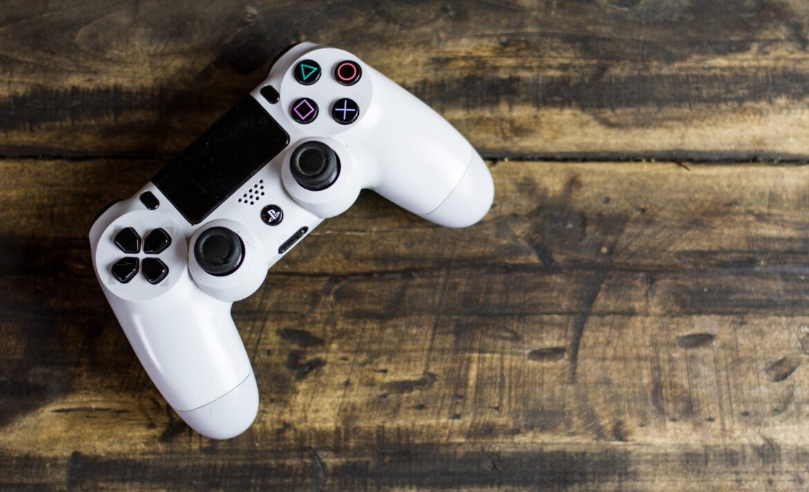
Gaming Accessibility: Why Disabled Gamers Deserve Better

by Sensory Diversity January 15, 2025
written by Sensory Diversity

In 2025, gaming has evolved far beyond the 8-bit graphics of the 1980s. Technological advancements have brought us immersive worlds, complex storytelling, and cutting-edge graphics. Yet, one glaring issue remains: the persistent inaccessibility of games for disabled gamers. Companies like BioWare, EA Games, and even platforms like Steam have failed to adequately address the needs of disabled players, leaving many feeling like second-class citizens in a medium they love.

The Problem with Modern Gaming Accessibility

Disabled gamers face significant barriers when trying to enjoy the same gaming experiences as others. While some progress has been made in areas like subtitles or customizable controls, other essential accessibility features are glaringly absent. For example, BioWare and EA Games—developers behind beloved franchises like Dragon Age and Mass Effect—still lack options to reduce motion effects, disable loading spinners, or turn off beeping and distressing sound elements. Additionally, flashing visuals, which can be disorienting or even dangerous for players with epilepsy or vestibular disorders, remain prevalent.

These issues aren’t minor inconveniences; they’re exclusionary. For someone with a vestibular disorder, a simple loading spinner can cause nausea, dizziness, or even vomiting. I experienced this firsthand while playing Dragon Age. The constant spinning elements made me so ill that I could barely continue, robbing me of the enjoyment of an otherwise fantastic game.

To make matters worse, many game companies make it nearly impossible to contact support to address these issues. Disabled players often find themselves navigating labyrinthine support systems or receiving generic, unhelpful responses. This lack of direct and effective communication further alienates players who are already struggling to access basic features.

Accessibility Isn’t a Luxury—It’s a Right

Rather than merely including warnings about potential issues for players with epilepsy or other sensitivities, game companies have a duty to implement proactive solutions. In today’s world, where technology offers unparalleled flexibility, it’s inexcusable that these features are still absent. A simple option to turn off loading spinners or reduce motion effects should be standard, not an afterthought.

Even Steam, the leading platform for PC gaming, fails in this regard. Despite its extensive library and customizable interface, it does not allow users to disable loading spinners in the UI. Why should disabled gamers be forced to endure discomfort just to enjoy their favorite hobby?

The Impact of Exclusion

For disabled gamers, these accessibility oversights are more than just technical issues; they send a clear message: “You don’t matter.” Gaming is a form of entertainment, community, and even therapy for many people. Yet, by neglecting accessibility, companies deny disabled players the chance to fully engage and enjoy these experiences.

When we’re told that our needs are too niche or that accessibility isn’t a priority, it’s dehumanizing. Are disabled people not worth consideration? Do our hobbies not matter? The exclusionary nature of the gaming industry’s current practices perpetuates feelings of alienation and frustration.

The Path Forward

The solution is clear: game companies must prioritize accessibility at every stage of development. This includes:

  • Reduced Motion Settings: Options to minimize or eliminate motion effects and loading spinners.
  • Sound Customization: The ability to disable beeping, high-pitched sounds, or other distressing audio elements.
  • Flashing Element Control: An option to turn off or modify flashing visuals to prevent triggering seizures or discomfort.
  • Universal Accessibility Standards: Industry-wide guidelines to ensure accessibility features are consistent across platforms and titles.
  • Accessible Support Systems: Streamlined and responsive support channels to address accessibility concerns quickly and effectively.

Implementing these changes isn’t just about compliance or corporate responsibility; it’s about fostering inclusivity and recognizing the diverse needs of all players. Gaming is for everyone, and it’s time the industry reflected that truth.

Conclusion

Disabled gamers deserve to enjoy the worlds, stories, and adventures that gaming offers without risking their health or enduring discomfort. The industry has the tools and resources to make this happen—all it needs is the will to act. It’s no longer acceptable to treat accessibility as an optional extra. The message to developers and platforms is simple: disabled gamers are not second-class citizens, and it’s time to treat them with the respect and consideration they deserve.


January 15, 2025 0 comments
0 FacebookTwitterPinterestEmail
cyborg, android, robot
AdvocacyUI Accessibility

The Hidden Barrier: How Captchas Exclude People with Neurological and Developmental Disabilities

by Sensory Diversity December 4, 2024
written by Sensory Diversity

Captchas—those seemingly simple tests designed to distinguish humans from bots—have become ubiquitous across the web, from logging into email accounts to submitting forms on social media. They often require users to complete puzzles, click images, or listen to audio, tasks that rely on visual, auditory, and cognitive skills. While these tests were originally intended to prevent automated bots from infiltrating websites, they inadvertently create a significant barrier for people with a wide range of neurological and developmental disabilities.

Two of the most prominent types of Captchas, those used by platforms like Twitter and Google, present particular challenges for individuals with cognitive, sensory, and motor impairments. While these security measures may seem harmless, they pose accessibility issues that are rarely addressed in the design of the systems. By creating additional hurdles for people with disabilities, Captchas not only fail to live up to their promise of inclusivity, but they also raise critical questions about who is truly being kept out of digital spaces.

Visual and Cognitive Challenges: The Puzzle Problem

One of the most common types of Captchas asks users to identify and select specific images, often with seemingly arbitrary criteria (e.g., “Select all images with traffic lights” or “Click on all images that contain a bus”). These types of visual puzzles are highly problematic for people with visual impairments, cognitive disabilities, or conditions like dyslexia and ADHD.

For those with visual impairments, including blindness or low vision, these puzzles are practically insurmountable unless alternative accessible features are provided, such as screen readers or high-contrast mode. However, many Captchas are designed with limited accessibility, especially for individuals who need assistive technologies. Even when alternatives are offered, they often come with their own set of difficulties, particularly if the user lacks the necessary training or familiarity with such tools.

People with cognitive disabilities, such as autism or Down syndrome, may also struggle with the pattern recognition and decision-making involved in these tasks. The need to quickly differentiate between similar images (for example, “Select all images with a crosswalk” or “Choose the pictures that contain a storefront”) requires both cognitive speed and accuracy—abilities that can be significantly impaired in individuals with certain conditions.

Additionally, Captchas often present multiple steps or multiple images that must be clicked in succession, requiring sustained attention and focus. This can be a significant challenge for people with attention deficit disorders, who may find it difficult to complete the task in the required time frame. The added frustration of trying to solve an elusive puzzle under pressure can lead to feelings of exclusion and discouragement.

Auditory Barriers: The Hidden Struggles of Listening Captchas

In an effort to offer alternatives for those who cannot navigate visual puzzles, many Captchas also offer an audio version. These tests typically ask users to listen to a sequence of distorted numbers or letters and then input them into a text box. On the surface, this seems like a reasonable solution for individuals with visual impairments. However, for many people with hearing impairments or auditory processing disorders, listening Captchas present their own set of insurmountable barriers.

For individuals who are deaf or hard of hearing, the audio version of Captchas is useless without additional visual or text-based support. Even if captions or visual cues are provided, the distortion and poor quality of many Captchas’ audio files make it difficult to understand. The voices are often muffled, garbled, or spoken too quickly, making it almost impossible for users to discern the correct numbers or letters.

Moreover, people with auditory processing disorders, such as those with ADHD or autism, may struggle to process distorted sounds or rapid sequences of information. This presents an additional layer of complexity, as they may not be able to interpret the sounds as accurately as a person without such challenges, further increasing the likelihood of failure.

Motor and Sensory Barriers: Clicking and Captchas’ Impact on Physical Disabilities

While Captchas are typically designed to be a test of mental ability, they can also be challenging for people with motor disabilities. Tasks that require precise clicking, dragging, or selecting multiple images on a touchscreen can be difficult for individuals with limited motor control, such as those with cerebral palsy, multiple sclerosis, or other physical disabilities that affect dexterity. For these users, navigating Captchas often requires more time and effort, if it’s even possible at all.

The need to quickly click or drag images can be especially problematic for people with conditions that impact fine motor skills. Those who rely on assistive technologies, such as adaptive mice or voice commands, may find the lack of compatibility or the need for precise movements an additional source of frustration. Even users who are able to navigate the Captcha may face significant barriers due to the repetitive and time-consuming nature of these tests.

The Bigger Problem: Excluding Humans in the Name of Preventing Bots

While Captchas have undoubtedly helped curb automated abuse on the internet, they also have the unintended consequence of discriminating against people with disabilities. By relying on tasks that require rapid processing, complex reasoning, or specific sensory abilities, Captchas exclude individuals who may not fit into the “normal” range of cognitive, sensory, or motor capabilities. For these individuals, Captchas are not a test of human ability but a test of their ability to navigate an inaccessible and sometimes hostile web.

The irony is that in their attempt to separate humans from bots, Captchas often fail to accommodate the very people they claim to serve. They limit access to online resources, from critical services like healthcare websites to social platforms that allow users to engage with their communities. The end result is that, while bots are kept at bay, real humans—particularly those with disabilities—are left stranded on the outside.

Moving Toward Greater Accessibility: What Needs to Change?

To make the internet truly accessible, the systems we use must be designed with inclusion in mind. It’s important that developers and designers recognize the wide range of disabilities that exist and ensure that accessibility features are seamlessly integrated into Captchas and other web security measures.

First and foremost, Captchas must be designed to be fully accessible to people with a variety of disabilities, including visual, auditory, cognitive, and motor impairments. This includes providing clear alternative formats for both visual and auditory tests, such as more intelligible audio Captchas, and making sure that these alternatives are fully compatible with assistive technologies like screen readers and voice recognition software.

Additionally, developers should move away from overly complex puzzles and consider using other, more inclusive methods of verification. These could include biometric authentication, such as fingerprint or face recognition (where privacy concerns can be properly addressed), or time-based methods that don’t require direct user interaction.

Finally, as the digital world continues to evolve, it’s important to engage people with disabilities in the design process. They are the ones who experience these barriers first-hand and are best positioned to provide feedback on what works and what doesn’t. Creating an accessible internet is not just a technical challenge—it’s a human one. If we want to ensure that the internet is a space for everyone, we must prioritize the needs of all users, including those with disabilities.

Conclusion: Accessibility Isn’t Optional

Captchas are meant to protect websites from malicious bots, but the reality is that they also exclude people with disabilities from online spaces. The current design of many Captchas—whether visual puzzles, distorted audio, or complex tasks requiring fine motor skills—makes it difficult, if not impossible, for many people to pass the test, even though they are real, human users.

As digital spaces continue to grow and evolve, it’s crucial that Captchas and other online security measures become more inclusive. The internet is a space where everyone should be able to interact, learn, and engage, regardless of ability. By making small, thoughtful changes to the way we design online security measures, we can ensure that the web remains a space that is truly accessible for all.

December 4, 2024 0 comments
0 FacebookTwitterPinterestEmail
8fdhgan5zg0
Research

Empowering Misophonia Research: Turning Every Dollar into Discovery

by Sensory Diversity November 25, 2024
written by Sensory Diversity

When it comes to making a difference, every dollar truly counts. At the International Misophonia Foundation (IMF), your $1 donation fuels one hour of groundbreaking machine learning research. With each contribution, we move closer to understanding the complexities of misophonia—a condition that affects millions worldwide.

The Power of $1

For just one dollar, you enable our team to run Python scripts, analyze complex datasets, and unlock new insights into misophonia. Whether we’re delving into the acoustic properties of trigger sounds or conducting in-depth qualitative and quantitative studies, every donated dollar translates directly into action.

This approach ensures that every contribution, no matter how small, is maximized to advance misophonia research and support the global community affected by this condition.

What Your Donation Supports

  • Acoustic Analysis: Exploring the unique characteristics of sounds that trigger emotional responses in individuals with misophonia.
  • Data-Driven Insights: Applying machine learning to uncover patterns in qualitative and quantitative data, paving the way for tailored interventions.
  • Broader Awareness: Generating meaningful literature that informs healthcare providers, educators, and families about this often-misunderstood condition.

Join the Movement

Beyond donating, you can be part of the mission by participating in our research studies. Help shape the future of misophonia research by contributing your experiences or insights.

Together, We Make an Impact

Your support propels us toward a deeper understanding of misophonia, empowering better treatments and heightened awareness. With just $1, you can help change the narrative around misophonia, one hour of research at a time.

To learn more about our studies, participate, or donate, visit the IMF Research Page. Every dollar and every voice matters. Together, we can make a lasting difference.


November 25, 2024 0 comments
0 FacebookTwitterPinterestEmail
MacBook Pro
AdvocacyUI Accessibility

Accessibility Challenges of Adobe Products for Users with Vestibular Disorders, Epilepsy, ADHD, and Sensory Processing Sensitivities

by Sensory Diversity November 14, 2024
written by Sensory Diversity

Adobe’s suite of creative software has long been celebrated for empowering creators, designers, and businesses worldwide. Applications such as Adobe Acrobat, Photoshop, InDesign, Illustrator, and Premiere Pro are considered industry standards. However, for users with vestibular disorders, epilepsy, ADHD, misokinesia, and sensory processing disorders, these tools can be challenging to use due to inaccessible features and settings. In particular, many Adobe products lack options for reducing or eliminating animations, blinking cursors, and other visual effects that can be overstimulating or even harmful.

Persistent Animations and Lack of Customization Options

Despite the fact that operating systems like macOS and Windows now offer settings like “prefers reduced motion” and “prefers non-blinking cursors,” Adobe’s software often ignores or overrides these system settings. This leads to a series of accessibility challenges:

  1. Blinking Text Caret (Cursor)
    For those using Adobe Acrobat or other text-based Adobe applications, the blinking text caret can be a significant issue. A blinking cursor can exacerbate symptoms for individuals with misophonia, ADHD, and misokinesia, or sensitivity to repetitive, involuntary movements. Additionally, for those with vestibular disorders and epilepsy, these repetitive flashes can lead to dizziness, nausea, and, in some cases, migraines. Unfortunately, Adobe software does not offer an option to disable or reduce the caret blink rate, which can make reading or editing text a frustrating experience.
  2. “Marching Ants” Selection Indicators
    Adobe Photoshop and InDesign use blinking “marching ants” to outline selected areas. For users with ADHD, this persistent flickering can be highly distracting, while those with vestibular disorders may find it disorienting. The absence of an option to turn off or modify this visual effect means these users have little choice but to endure the discomfort or find alternative tools.
  3. Loading Spinners and Progress Animations
    Loading animations are common across Adobe products and typically consist of spinning or pulsating indicators. These animations can be problematic for users with sensory processing disorders and ADHD, as they draw attention and can overwhelm the senses, interrupting workflow. Adobe currently lacks an option to replace these animated indicators with static alternatives.
  4. Zoom and Pan Animations
    For individuals with vestibular disorders, animations for zooming, panning, and transitioning between views in Adobe Premiere Pro or After Effects can be disorienting. Though some Adobe software allows users to customize navigation and transitions, they are often inconsistent, leaving certain effects unmodifiable. This lack of uniformity can be disorienting for individuals sensitive to motion and may contribute to motion sickness or other vestibular symptoms.

Broader Accessibility Needs Across Adobe’s Suite

Adobe has recently made strides toward more accessible design features, such as improved screen reader compatibility and captioning options in video software. However, the needs of users with sensory processing sensitivities, ADHD, and neurological disorders remain largely unaddressed.

While there are a few workarounds, they often require advanced technical knowledge and may only partially mitigate symptoms. For example, users can attempt to install third-party plugins to reduce or eliminate certain animations in Photoshop and Illustrator, but these solutions are neither seamless nor foolproof. Additionally, such workarounds may not be accessible to all users, particularly those without a strong technical background.

Moving Toward More Inclusive Software Design

Adobe has the opportunity to improve accessibility by developing customizable options for users who require minimal visual stimulation. Potential solutions could include:

  • Respecting System Settings: Adobe could modify their software to adhere to system-wide preferences for reduced motion and non-blinking cursors. Following these preferences would allow users to rely on their operating system settings for a consistent experience across applications.
  • Offering Static Display Options: Providing an option to display static indicators instead of animations (such as non-blinking selection outlines or progress indicators) would make these tools far more user-friendly for individuals with sensory sensitivities.
  • Customizable Caret and Selection Styles: Adobe could allow users to choose caret styles, blinking speeds, or disable blinking altogether. In addition, they could offer alternatives to the “marching ants” selection that do not require flickering lines.

Ultimately, improving accessibility for users with vestibular disorders, epilepsy, ADHD, misokinesia, and sensory processing disorders is not only a matter of inclusion but also of ethics and innovation. Designing with accessibility in mind ensures that Adobe’s powerful tools can be used safely and effectively by a broader audience, reducing barriers for creative professionals who require a more static, visually manageable workspace.

November 14, 2024 0 comments
0 FacebookTwitterPinterestEmail
ke0nc8 58mq
AdvocacyUI Accessibility

Microsoft Office’s Ignorance of Apple’s Blinking Cursor Accessibility: A Missed Opportunity on Sequoia and iOS 18

by Sensory Diversity November 3, 2024
written by Sensory Diversity

In the latest strides for accessibility, Apple’s recent updates to Sequoia OS and iOS 18 have brought in a thoughtful feature that allows users to turn off the blinking cursor. This addition caters specifically to users with sensory sensitivities who may find blinking cursors distracting or even overwhelming. Despite Apple’s groundbreaking changes, however, Microsoft Office has not yet integrated this option, leaving many users disappointed. As of now, this omission stands out, particularly when accessibility is increasingly becoming a benchmark for inclusivity in tech.

Why Apple’s Blinking Cursor Option Matters

The option to hide a blinking cursor might seem trivial, but for individuals with sensory processing disorders like misophonia, autism, or ADHD, the impacts are significant. These users can find blinking elements highly distracting, disruptive, and even anxiety-inducing. By introducing a toggle for this feature, Apple has acknowledged the needs of a wide user base who benefit from a visually calmer, more controlled digital environment.

Apple’s decision to offer a non-blinking cursor reflects its broader commitment to accessibility. In a world where users increasingly rely on digital tools for productivity, having customizable options that support sensory-friendly experiences becomes essential. Apple’s updates have been particularly well-received by neurodiverse individuals, and the hope was that other tech giants would follow suit. Microsoft, as a leader in office productivity, was a natural candidate to bring this change to its own ecosystem—but unfortunately, has not yet done so.

Microsoft Office: A Key Player Missing the Accessibility Mark

Microsoft Office is a staple for productivity software, with millions of users relying on Word, Excel, PowerPoint, and other apps daily. This suite is commonly used by businesses, schools, and individuals across industries, and given its wide reach, accessibility considerations should be paramount. As Apple users explore the option to reduce visual disturbances on their devices, they are now looking to their productivity apps for similar features. For users with sensory sensitivities, Microsoft Office’s lack of this simple toggle disrupts their workflow and limits the extent to which Apple’s new accessibility can be fully enjoyed.

The decision to retain the blinking cursor is puzzling, as Microsoft has typically been proactive in developing inclusive features. Microsoft’s own Accessibility Center has led the charge for better tools supporting individuals with vision impairments, dyslexia, and other disabilities, but on this particular front, it appears they’ve lagged.

The Growing Need for Sensory-Friendly Digital Environments

In an era where user-friendly options and customization are increasingly standard, especially for neurodiverse communities, every software giant is tasked with keeping pace. Features like cursor toggling aren’t merely about preference; they’re about enabling productivity in a way that doesn’t create barriers for users. This is where Apple’s decision has resonated so strongly—it understands that inclusive design isn’t an afterthought but a fundamental aspect of good design. For many neurodivergent individuals, managing stimuli is critical to creating a workspace that allows them to perform at their best.

What Microsoft Can Do Moving Forward

For now, neurodiverse Microsoft Office users on Apple’s platforms are left to work around a blinking cursor that can negatively impact their experience. Microsoft can address this gap by implementing a cursor toggle in future updates of its Office suite on both macOS Sequoia and iOS 18. Listening to user feedback, particularly from the sensory-sensitive community, would send a positive message about Microsoft’s commitment to accessibility and its adaptability in the evolving tech landscape.

In the interim, Microsoft’s failure to respond to Apple’s initiative creates a noticeable divide, reflecting missed opportunities in collaborative accessibility and user experience innovation. By mirroring Apple’s example and prioritizing sensory-friendly options, Microsoft could make strides toward a more inclusive ecosystem and lead by example for the rest of the industry.

Ultimately, as tech moves forward, there is a growing call for all tech providers to prioritize features that reduce unnecessary visual stimuli. Users have made it clear that these changes matter, and companies that respond to these requests will ultimately foster a more loyal and inclusive user base. As Apple sets the bar, Microsoft has an opportunity to align itself with the accessibility needs of a global, diverse audience.

November 3, 2024 0 comments
0 FacebookTwitterPinterestEmail
bigpii04uig
AdvocacyUI Accessibility

Apple’s Non-Blinking Cursor: A Step Forward for Accessibility, but Still Flawed

by Sensory Diversity October 22, 2024
written by Sensory Diversity

Apple’s recent updates in iOS 18 and macOS Sequoia have introduced a long-requested feature: the option for a non-blinking cursor. This enhancement is a significant step forward for accessibility, particularly for users who find blinking cursors distracting or uncomfortable. However, while this move is commendable, it also highlights deeper flaws in Apple’s approach to accessibility, especially on macOS.

The Promise of a Non-Blinking Cursor

For many users, the new non-blinking cursor option offers relief from the visual strain caused by traditional blinking indicators. It’s a thoughtful addition for those with sensory sensitivities or conditions such as ADHD. The ability to customize the cursor’s behavior aligns with a growing recognition of the importance of user-centric design.

However, this feature’s implementation is limited. It currently functions effectively only in applications that utilize NSText, Apple’s native text handling system. Unfortunately, many essential applications, including Microsoft Office, do not integrate with NSText. This oversight underscores a significant gap in accessibility support, as users who rely on these widely used programs are left without the benefits of the non-blinking cursor.

Accessibility: A Long-Standing Oversight

This situation serves as a stark reminder that, despite some advancements, both Apple and third-party developers have often overlooked the needs of users requiring accessibility features. The introduction of the non-blinking cursor, while welcome, feels like a small concession in a landscape where comprehensive accessibility solutions are still lacking.

For years, users have pointed out the need for more robust options that cater to various disabilities and preferences. The non-blinking cursor is just one aspect of a larger puzzle. Many users still encounter challenges that hinder their productivity and overall experience on both iOS and macOS.

Beyond the Cursor: A Call for More Customization

Apple’s accessibility initiatives should extend beyond cursor options. One area that requires urgent attention is the customization of loading animations, such as spinners and the spinning beach ball of death. These animations can be frustrating, especially for users who are sensitive to visual stimuli. Allowing users to disable or modify these animations could significantly enhance the experience for many.

For instance, the repetitive motion of loading indicators can feel overwhelming and distracting, akin to a form of visual hypnosis. As a humorous aside, if users wanted such experiences, they might as well seek out a trained professional for EMDR therapy!

A Shared Responsibility

The responsibility for improving accessibility does not rest solely on Apple. Third-party developers, particularly those of widely used applications like Microsoft Office, also play a crucial role. They need to prioritize accessibility by adopting frameworks that support the features users are calling for, such as the non-blinking cursor.

As Apple moves toward a more inclusive environment, it’s imperative that they collaborate with developers to ensure a consistent and comprehensive approach to accessibility across all platforms and applications.

Conclusion

The introduction of a non-blinking cursor in iOS 18 and macOS Sequoia is undoubtedly a step in the right direction for accessibility. However, the limitations of this feature reveal significant gaps that still need addressing. For true progress, Apple must look beyond isolated enhancements and commit to a broader strategy that encompasses all applications and aspects of the user experience. Only then can they create a truly inclusive environment where every user can feel comfortable and empowered.

October 22, 2024 0 comments
0 FacebookTwitterPinterestEmail
Newer Posts
Older Posts

Sensory Diversity is the recognition that every individual perceives, filters, and responds to the world in a unique way. While neurodiversity celebrates the different ways we think, sensory diversity focuses on the gateway to those thoughts: our senses.

Social media infographics and posts are not a reflection of the views of the site owner or individual site authors. These posts come from a variety of sources and reflect numerous viewpoints through the sensory and neurodiversity community.

Recent Posts

  • Sensory Accessibility Suggestions for World of Warcraft
  • When It Isn’t ADHD or Autism: The Lost Tribe of Neurodivergence
  • What It’s Like Living With Misophonia
  • How Misophonia Actually Feels for Sufferers
  • What is Sensory Dysregulation?

Recent Comments

  1. Lilian on Misokinesia
  2. admin on Misokinesia
  3. Dense Caldwell on Misokinesia

Product links may be affiliate links. This site makes a small commission off these links.

  • Facebook
  • Instagram
  • Linkedin
  • Tumblr

@2021 - All Right Reserved. Designed and Developed by PenciDesign


Back To Top
Sensory Diversity
  • Home
  • Blog
  • Neurodivergence
    • What is Autism?
    • What is ADHD?
    • What is Sensory Integration / Sensory Processing Disorder?
    • What is Misophonia?
    • What is Misokinesia?
  • Sensory Lifestyle
  • Sensory DIY

Shopping Cart

Close

No products in the cart.

Close